| Home |
|||
|
|
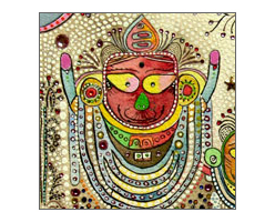 The landing page of the Image Gallery has four such thumbnails.
|
The Challenge In our first briefs with him, it became quite obvious that artists are a quirky breed. At once brilliant in their poetic vision, they are nonetheless completely at a loss when it comes to expressing that vision to others. He hated dark colours, he didn't like rounded borders, yet all the sites he "liked" had black backgrounds and white text. In fact his own blog was designed exactly the way he didn't want us to build his site. His requirements from us were very simple: no commerce, no prices, no self-flattery, very little about Olaf, paintings to speak for themselves, use of light pastel colours, preferably white. The challenge before us lay in creating a design that interfered as little as possible with his art, that receded well into the background, yet provided enough of a presence and consistence. The Process |
||

The sidebar navigation is equally simple. An orange hilight and an orange vertical line contrast with the grey links and page text.
|
The navigation system was deliberately kept simple. Seen here, these are purely text links in Times Roman, and change hilight from grey to orange to indicate the current section. Olaf's signature, vectorised in Illustrator provides the necessary identity to the website.
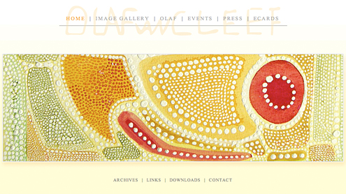
To give a very compact and focused look to the site, our designer chose to use a fixed frame design. The frame consisted of a rectangle with a white to ivory gradient and a drop shadow, suspended over a completely white page. A traced and slightly stylised signature provided the identity we were desperately looking for. Placed on top of the canvas, it acted as the masthead for the entire site, giving all pages a unified look. The only issue was with the height our designer let us use for the content area: 250 pixels. How to display all the content in such a tight vertical space? Some clever browser-side scripting did the trick. We built our own mechanism to scroll the content within the available space. The most important aspect of the site was the image gallery. This is where visitors would come to see Olaf's art. Not happy to simply present all images in sequence, we requested Olaf to provide some sort of categorisation for the paintings. He came up with four collections, each with a short description on his approach, thought and inspiration. Images were grouped by collection and this formed the landing page of the Image Gallery. Almost covering the entire content area, the four cropped images provided the navigation cue to access the image gallery for that collection. To complete the website, we wanted some kind of slideshow on the home page which would invite visitors into the site. We didn't want to use Flash to provide the cross-fade transitions. Instead using pure javascript and CSS techniques we created a cross-browser slideshow that didn't require viewers to download any additional plugins.
The home page with a crossfading slideshow done purely in Javascript. We used closely cropped sections of Olaf's paintings as slides.
|
||
|
|
The Result |