| Home |
|||
|
|
|
THe home page of the site features a large logo. The Teentaal logo was designed by a friend of the client in France. The stylised 'T' has obvious resemblance to the top of a sitar with its tuning knobs.
|
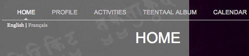
The Challenge However, the site being primarily for a western audience, it could not be too "Indian" in its presentation. Yet, as it would also be visited by Indian artists who were interested in working with Igor's organisation, the site would have to appeal to their aesthetics as well. Musicians being a lot with a highly developed sensibility, we felt the site should have a seriousness and austerity that reflected the subject matter. Igor also wanted the site and the CMS to be bilingual so we had to support content in both English and French. The Process Breaking away from convention, we decided to place the company logo in the bottom right of the page, below the image. This gave us a really clean and uncluttered navigation system. However, this caused one obvious problem. People viewing the site on smaller screens, found the logo partially cut at the bottom. we came up with a clever hack. The logo always sticks to the bottom of the browser screen and masks the image positioned above. To make language selection and the page URLs as user-friendly, we implemented URL rewriting for the entire website. Users choose their language just below the primary navigation bar.
Part of the top navigation bar. The language selector is just below that.
|
||

All pages are divided into two vertical areas. A large image on the right, is the primary focus of the page. The site branding appears right below this image.
|
The Result His first concerts have been a great success and have given other artists a reason to work with him. The site is an integral part of his work and acts as a connecting bridge between his musicians and his audience.
|