| Home |
|||
|
|
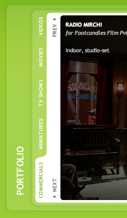
Rotated vertical tabs act as secondary navigation links. This allowed us to use as much space as possible for the images and also to stretch things out horizontally on the screen.
|
When Rajnish Hedao called us up, we had never heard of Acropolis DMG. He introduced himself as a friend of Mark Lapwood and that we were recommended by him for their new website. When we did a background check on them, we found a few references to the tripod team that is Acropolis and also came across their existing website. One look at it, and we were all sure that they were certainly not the kind of clients we would be happy to work with. Well, doesn't a company's business collateral, or its website speak volumes about the image the company has of itself? Isn't it the reason for which we even have a job as web designers and graphics professionals? After all someone who accepts poorly executed work from a professional can certainly not have an eye for beauty and aesthetics. At least not to the level we expect from our clients. We couldn't have been more wrong in the case of Acropolis. A quick confirmation from Mark assured us that they were the best one can find in their field of work and that we shouldn't judge them by their existing website. When high resolution images from their recent work started to pour in, we were amazed at what these folks were capable of doing. The Process
The site has exactly 5 pages. We decided to use bold saturated colours for each page. The navigation links were made into large blocks with the same colour as their respective pages.
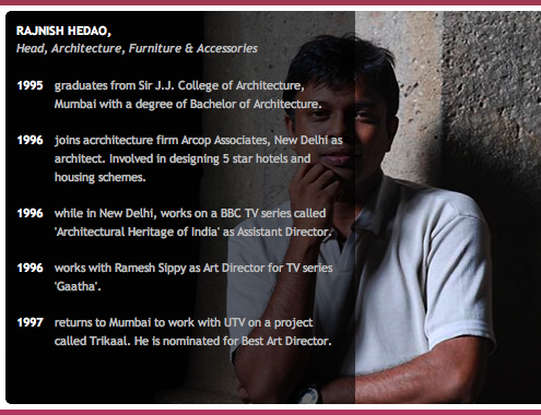
Once the copy was in place we were ready to make them a quick prototype site and a CMS. This helped test out the website for any navigational or content issues. For the design, as the target audience was from the entertainment industry, we decided to have some fun with bright colours. As the site structure was rather simple, we decided to use large buttons for section links and colour-coordinated the pages with the link buttons. The images became the heart of the site. Some nifty javascripting and CSS made the pages more interactive. Images slide up and down, additional project and client information, team member profiles, are all overlaid on a semi transparent CSS layer and slide in out over the images.
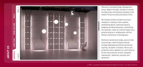
We designed the site around their wonderful images. Each page consists of one large image with text in light gray on the side.
|
||

We designed our own custom scrollbar for the content area of each page.
|
The Result
Information is overlayed on top of images in a black translucent layer that slides in from the left.
|