
| Home |
|||
|
|

Seen here, the primary navigation system on the left of every page. All sublevel links are tucked away and only icons are visible. Rolling the mouse over an icon brings up a semi translucent balloon with links for that section.
|
The Challenge His first call to us was asking whether we knew what a CMS was and whether we could build him one or not. He was not interested in working with us if we couldn't build him one. This showed more his frustration at his existing setup than a lack of faith in us as a design and development team. Of course we knew about CMSs (or Content Management Systems). In fact we build our own fully customisable CMS called Tailspin. So we just smiled at ourselves over his concerns. When he showed us his existing website, we realised the problem. It was a beautiful site. How do you improve on something that is already so good to start with? A team in Singapore had built him his website. But being a static website, it was impossible for Mark to keep it updated without him learning the nitty gritties of HTML and File Transfers and what not. We had a difficult choice in front of us. Either to reuse the existing site design but rebuild it from scratch so that it can be fed content from a CMS. Or to scrap it entirely and build anew. As painful as it was to throw away something good, we finally decided on the latter.
The home page of the old site. We retained the same colour scheme for the new website but redid the entire layout.
|
||
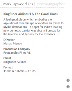
The content area on the inner pages. As the pages have a fixed height, we needed a mechanism for scrolling the text in cases where it was larger than the height alloted for the content. The two little arrows automatically scroll the text on mouseover.
|
The Process The home page mimicked the front of the card and the inner pages of the website looked a lot like the back of his visiting card. To make the images and video clips more striking, we decided to use only grey and white as the colour for the entire site. We stripped down all visual elements to the bare minimum. Even the navigation system was reduced to simple icons. No text was visible unless a you moused-over on link elements. We hate pop-ups. Slideshows, videos, images, should all appear inline, within the same page. Not bring up additional windows as was the case in the previous website. After a lot of struggle and technical roadblocks, we finally managed to make everything work within one window, yet give the feeling of being in a different mode while watching a video on the site or seeing a slideshow of Mark's still photography.
The inner pages resemble the back of Mark's visiting card. The 'dock' holding the images slide up and down on mouseovers to reveal the individual projects in a section along with an info bubble with the title of the project.
|
||
|
The Result Mark keeps the site updated on a regular basis thanks to how easy it is to use our CMS. He can now showcase his most recent work to potential customers and directors around the world.
The home page, with streaming thumbnails of work done by Mark. Mousing over, pauses the animation and shows an info bubble.
|


